Optimizing auto-investing for higher engagement and revenue
.avif)
Impact
Even without formal analytics, I built a simple evaluation loop using usability testing, quick-understanding checks, and validation workshops across Product, Ops, and Support. This gave us confident, behaviour-based signals about what was working. Users understood the feature much faster
Key Outcomes
💡Across five moderated tests, users were able to grasp the idea of SaveBack about 70% faster.
How we measured this:
During testing, we asked users to explain the feature in their own words as soon as they landed on the screen.
- In the old version, most needed ~45–60 seconds before they could describe it correctly.
- With the redesign, they could do it in ~15–20 seconds and with far fewer mistakes.
🎤 Users described the new version as:
“Finally clear,” “makes sense instantly,” and “easy enough to start.”
🙋🏻 4 out of 5 participants said they would activate SaveBack after seeing the new model.
- Even non-investors reported they felt “safe enough to try.”
📄 Teams aligned around one story. Before the redesign, each team had a different explanation of how SaveBack worked. The new mental model created one shared narrative that Product, Marketing, Risk, and Support all adopted.
📞 Client support team confirmed it did reduce recurring questions like: “Where exactly is my money going?” and “How does this investment thing actually work?”
Ideal Metrics (If Analytics Had Been Implemented)
Activation & Engagement
- How many people actually turn on SaveBack
- How quickly they turn it on (fast = they get it)
- Where they drop off during setup
Financial Signals
- Average amount saved/invested each month
- How many non-investors become investors through SaveBack
- Revenue uplift from active SaveBack users
Contributions
- Created cross-team alignment: I brought Product, Marketing, Risk, and Operations together around one simple, shared narrative for SaveBack — replacing multiple conflicting explanations with a single, clear mental model. This clarity strengthened both internal confidence and external communication.
- Led user testing with a structured, evidence-driven approach: Because we lacked analytics for this project, I turned user testing into our primary decision engine. I designed and ran the sessions, measured understanding through real-time explanations, and used these insights to guide design direction. These tests revealed that users understood the feature ~70% faster, which directly informed what we simplified, clarified, and removed.
- Connected product, design, support, and operations
- Advocated for a measurable roadmap: Even without tracking in place, I defined the metrics that should have guided the feature - from activation and contribution behaviour to trust indicators. This created a simple, actionable measurement framework that the team could adopt moving forward.
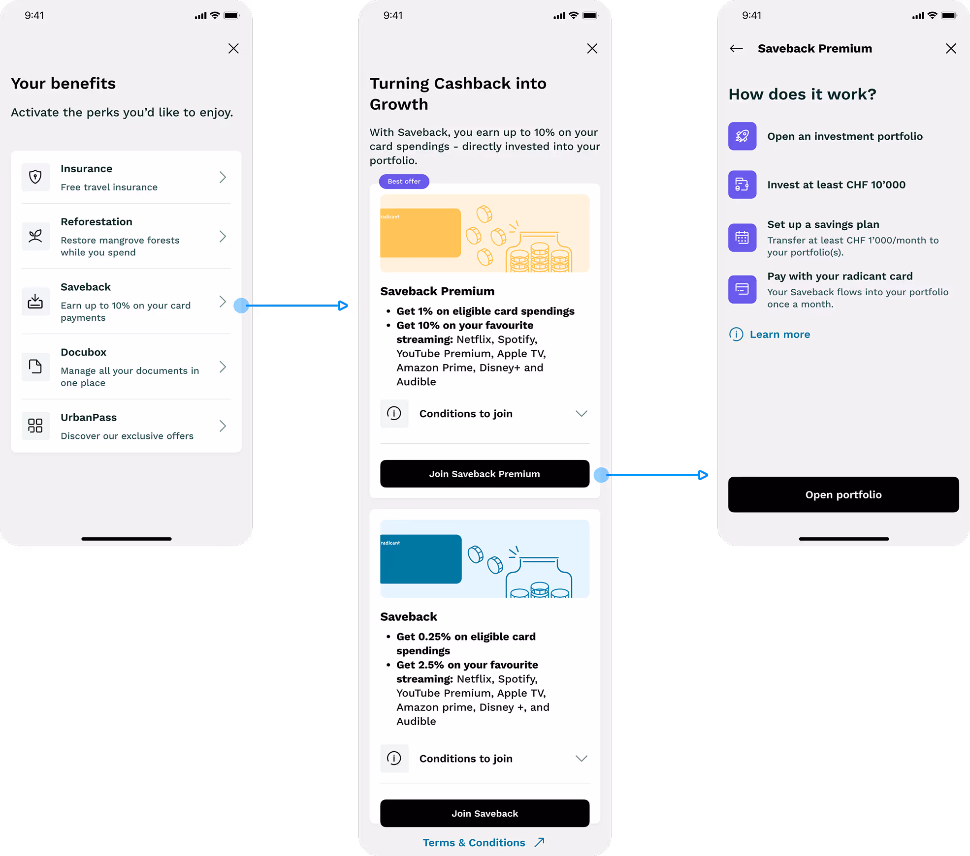
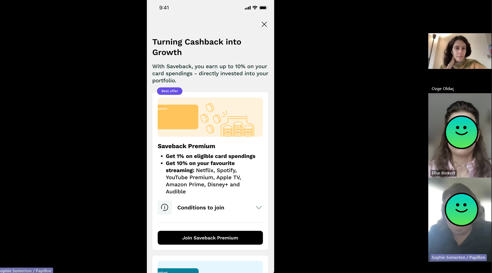
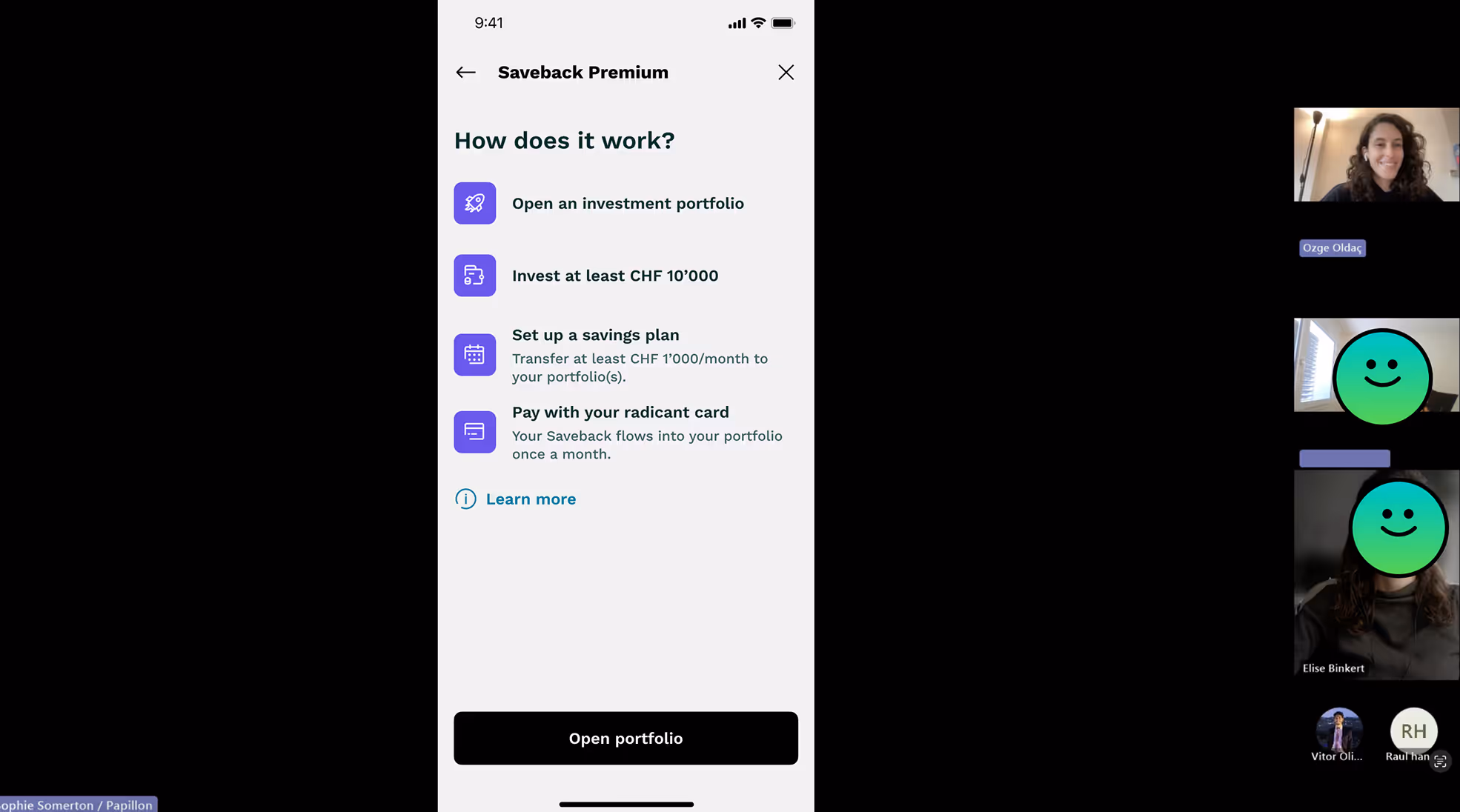
User testing sessions (Comparing old & new flows)
Saveback subscription flow - old experience
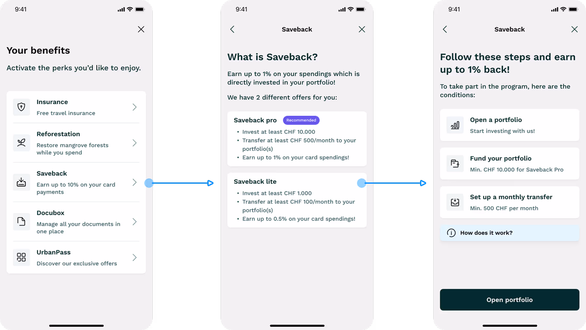
Redesigned experience