Meditopia
Onboarding
I am personally into meditation and mental health so working on this project was such a fulfilling experience. I collaborated with the PM and a fellow designer at Meditopia.
We were asked to redesign the onboarding experience on Meditopia, depending on different personas. Since there are different user groups coming to Meditopia (for better sleep, for high levels of stress, or for a healthy lifestyle/habit) After downloading the app users wouldn't understand how to get benefit from it, so our churn rate on onboarding was 40%.
It was the kind of task where we needed to put forward personalization & come up with unique solutions for different personas.
A/B Testing
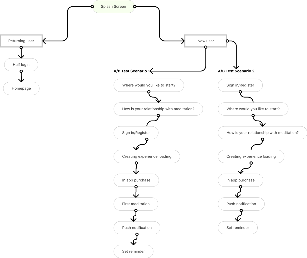
While working on wireframes for each scenario, we also ran A/B test with our current flow to have a better understanding of how the order of the sign-in screens would affect the user's behavior. (Whether to show sign-in screen at the beginning or later)
We discovered that the users on scenario 1 (the ones that see the sign-in after making some personal selections) were more likely to keep staying on the onboarding flow.
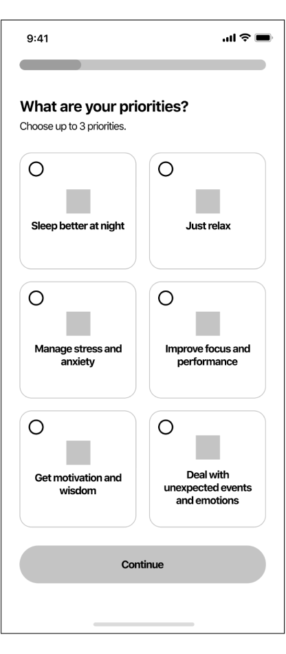
Wireframes & Low Fidelity Mockups
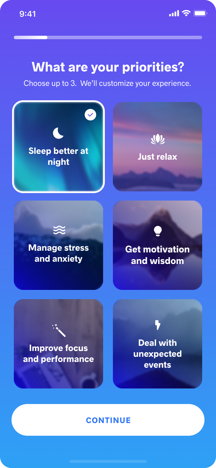
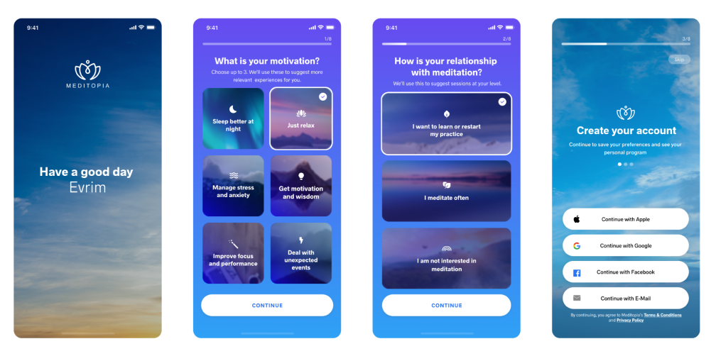
1) It's shown if the user makes choices about meditation during priority selection
2) It's shown if the user makes choices about sleep during priority selection
3) Content changes according to the selection user makes in their priority selection.
4) The quotes change according to user's priority selection.
5) Returning users start the process here.
Highlights from Usability Tests
We got together with the users from the beginning of the process to test the flows and the initial wireframes. It was important to gain feedback on what users would expect to see, and how we were going to stand out from other meditation apps. The users were able to complete the process successfully and they were happy seeing personalized content related with their choices.
On the last screen where we show them their first meditation, they found 5-8 min meditations too long. As completing something and wanting to actually use the app quickly - or get back to their current life they didn't want to stay for 5 more minutes within the flow and mostly skipped. So with this information, we changed the first meditation length to 1 min to keep it short and like a welcome message.
On the payment screen, they expected to see some real content from the app. They wanted to have visibility of what they'll pay for. Keeping them in mind, we moved on to our UI designs by placing some current meditations from the app.
- On the last screen where we show them their first meditation, they found 5-8 min meditations too long. As completing something and wanting to actually use the app quickly - or get back to their current life they didn't want to stay for 5 more minutes within the flow and mostly skipped. So with this information, we changed the first meditation length to 1 min to keep it short and like a welcome message.
- On the payment screen, they expected to see some real content from the app. They wanted to have visibility of what they'll pay for. Keeping them in mind, we moved on to our UI designs by placing some current meditations from the app.
Delivery UI
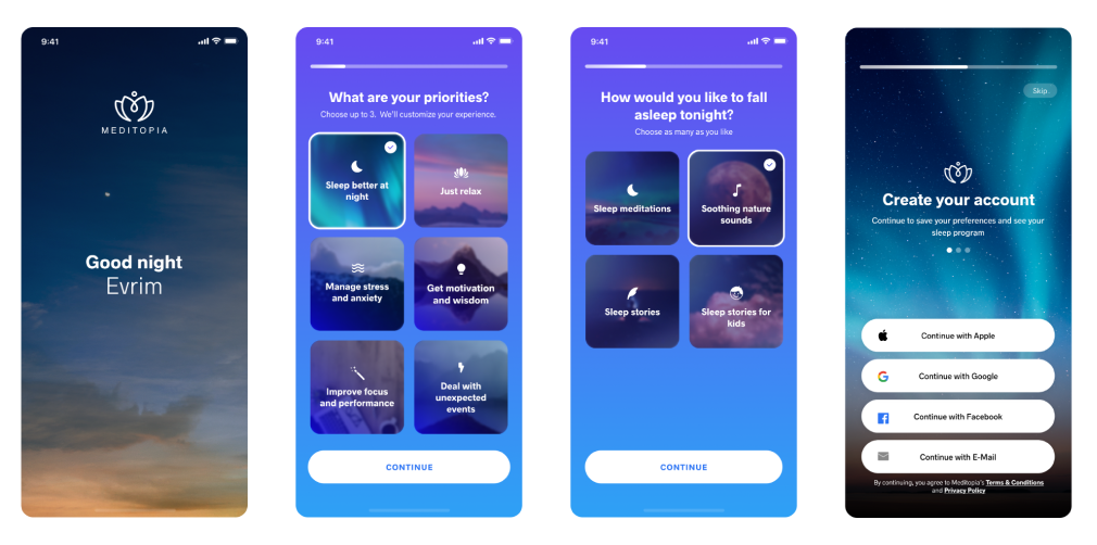
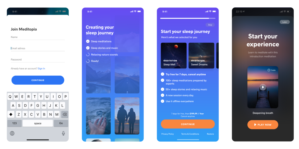
Sleep Flow (Only for the sleep persona)
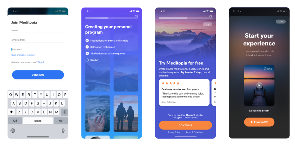
Flow 2 (For the other personas)