Simplifying scheduling for healthcare practitioners

When I joined Okadoc, I stepped into the sole product designer role for Okadoc Pro - a hospital and clinic management platform used daily by thousands of practitioners across the UAE. Partnering closely with the PM and Head of Product, I was responsible for redesigning one of the most critical parts of the product: the calendar and appointment-creation experience.
Impact
🧪 User Testing & Insights
- During user testing sessions and internal workshops, we identified that 70%+ of scheduling errors were caused by visibility issues (overlapping appointments, unclear status indicators, and poor hierarchy of information).
- Discovered through moderated testing that doctors struggled to locate appointment types quickly, adding ~40 seconds per booking, impacting patient throughput.
🤝 Cross-Functional Collaboration
- Led multiple workshops with the Implementation & Customer Success teams and admins, surfacing real-world scheduling pain points and high-risk scenarios (double bookings, custom timetables, recurring appointments).
- Worked closely with engineering to define technical constraints and create a component-based calendar system that could scale across clinics of different sizes.
📉 Reduced Support Tickets
- After launch, Customer Success reported a sharp reduction in calendar-related support tickets, particularly around missed slots, unclear appointment statuses, and calendar configuration issues.
🚀 Improved Practitioner Efficiency
- Doctors and clinic assistants reported that the new flow allowed them to create and modify appointments significantly faster, with the new UI reducing friction in high-pressure clinical settings.
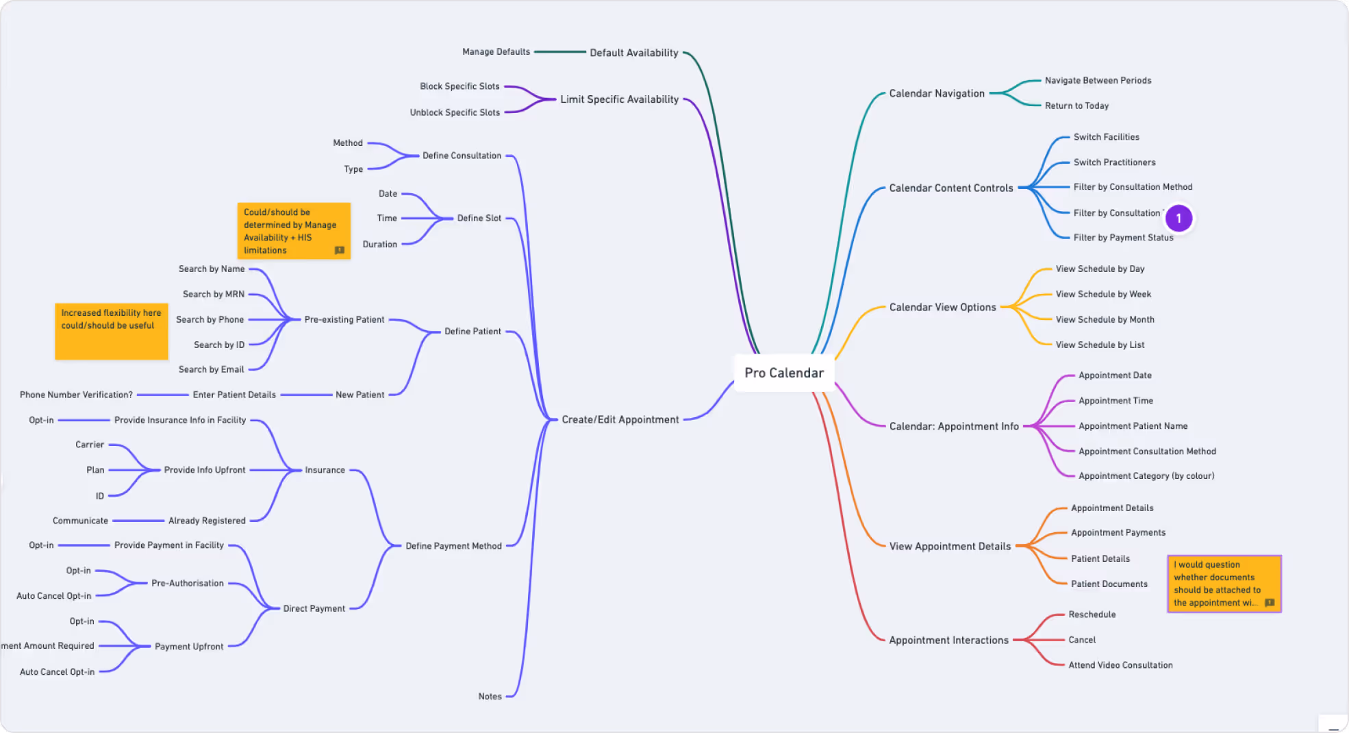
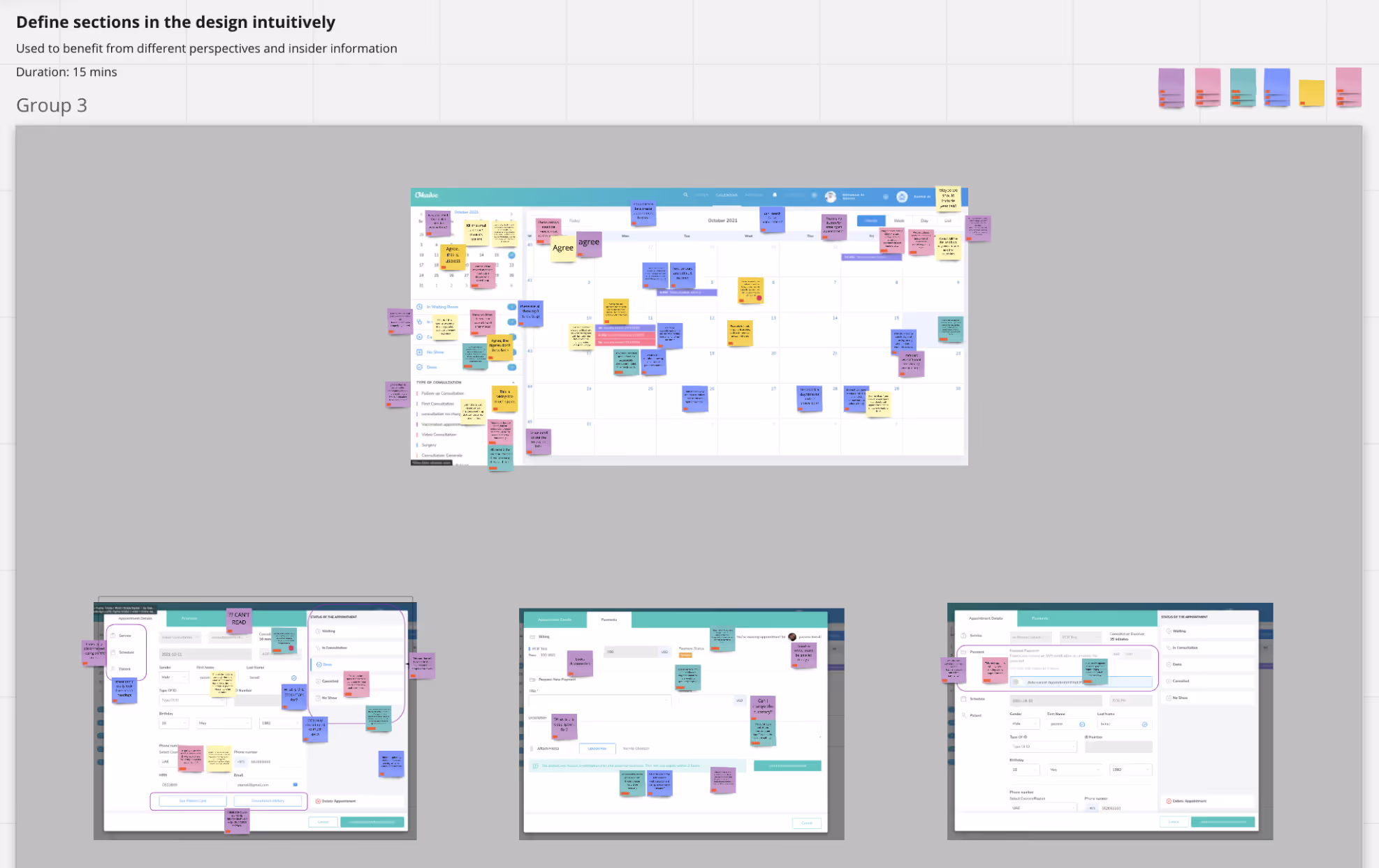
Defining User Actions
Since there are too many actions to be done from the calendar, we started writing them down with the product owner. It was a crutial process for us to see clearly what we already have, and decide on what to keep and what to add to the current possible actions.
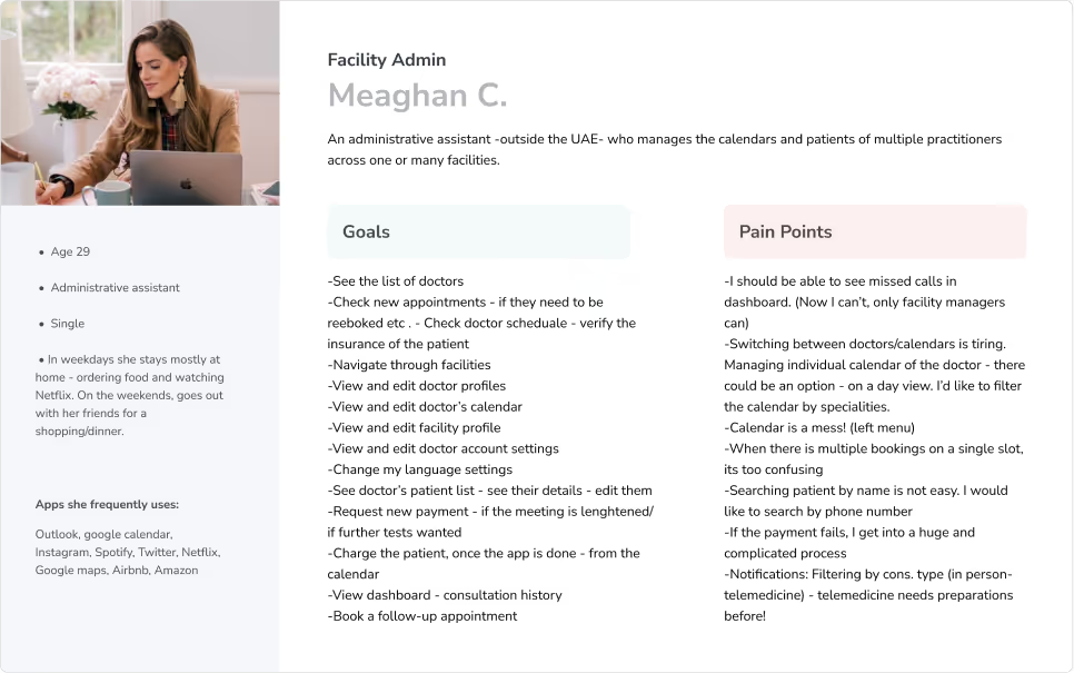
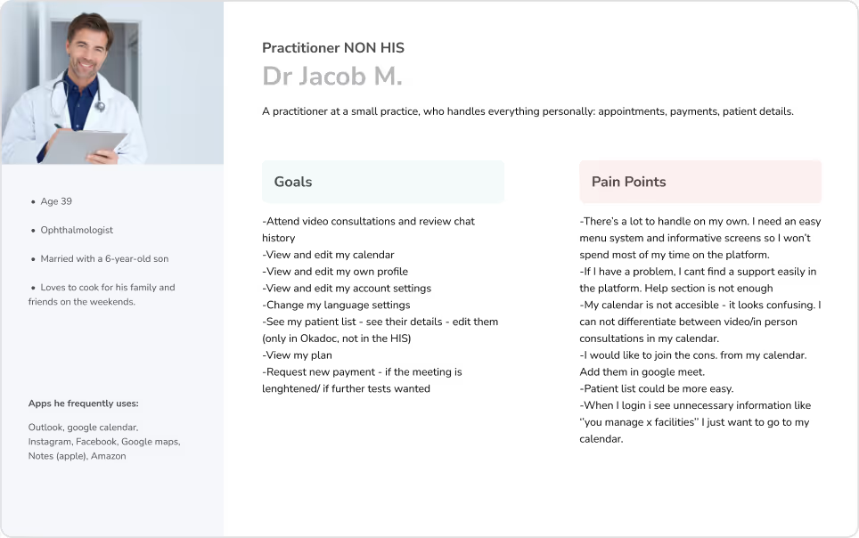
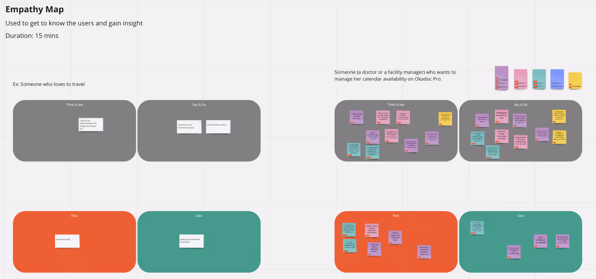
Persona Boards
Discovery Workshop
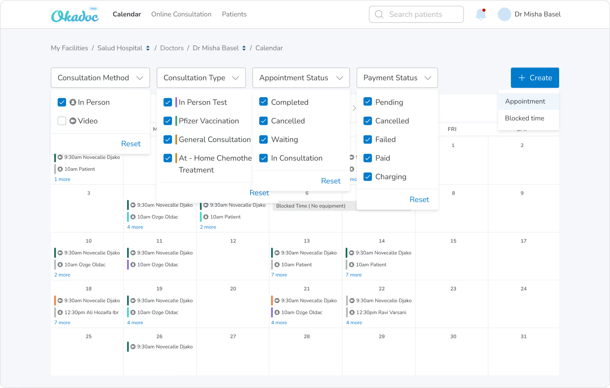
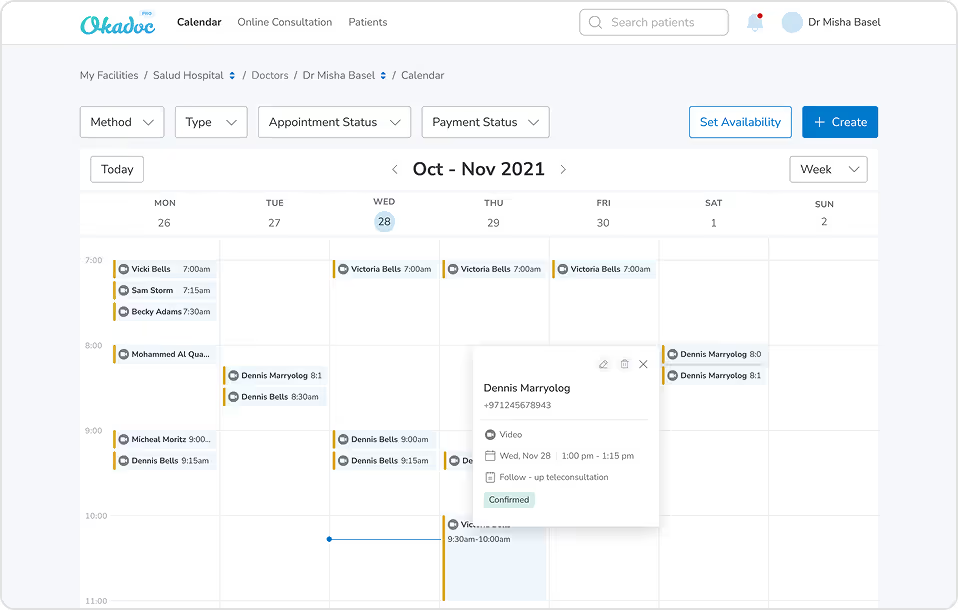
I ran an internal workshop with the customer success team, which had an empathy map exercise and a session to give/share feedback on the current design. We got to understand our users more and discover the real pain points. There wasn’t any option for filtering, so when a doctor wants to see specific cases i.e only appointments with canceled payments - it was a long process for them. Also, the create appointment action was in a big modal and it was a tedious experience for the users to fill in that huge form. They were likely to miss fields because of the layout. The other biggest pain point we had was not being able to differentiate between the video and in-person consultations from the calendar(at first glance). I was an important one because each appointment method has different necessities. For example, video consultations need a little bit of preparation before starting. (Opening the link, checking the mic & video quality, inviting the patient etc.)

Highlights from Usability Tests
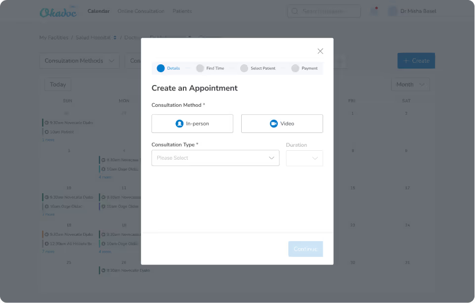
We ran user tests both on our online platform and internally on create appointment and set availability flows within the calendar. Firstly, we only had + icon button for creating appointments and the users did not easily recognize that button. So we also added the create label next to it and it was much easier for them. Also we saw that the users were mostly trying to click on the calendar itself
(rather than the create button above) so we added a new function for creating appointments by clicking on the calendar.
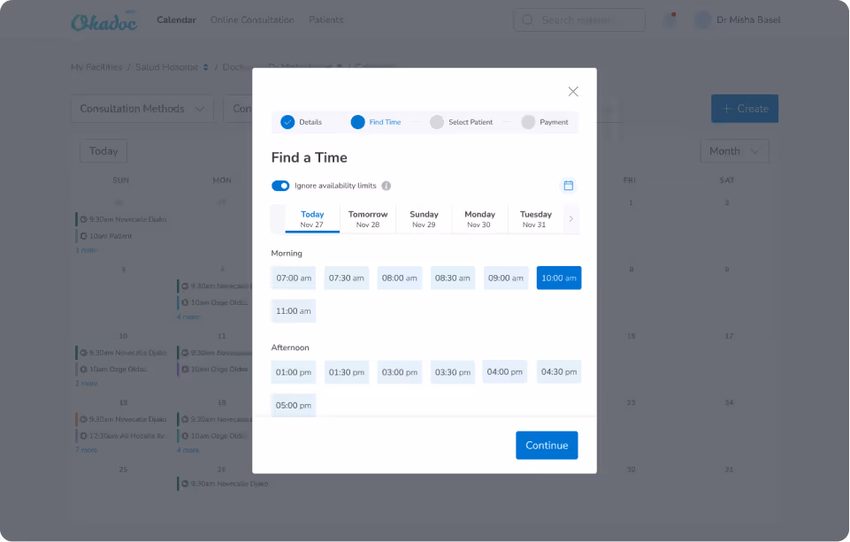
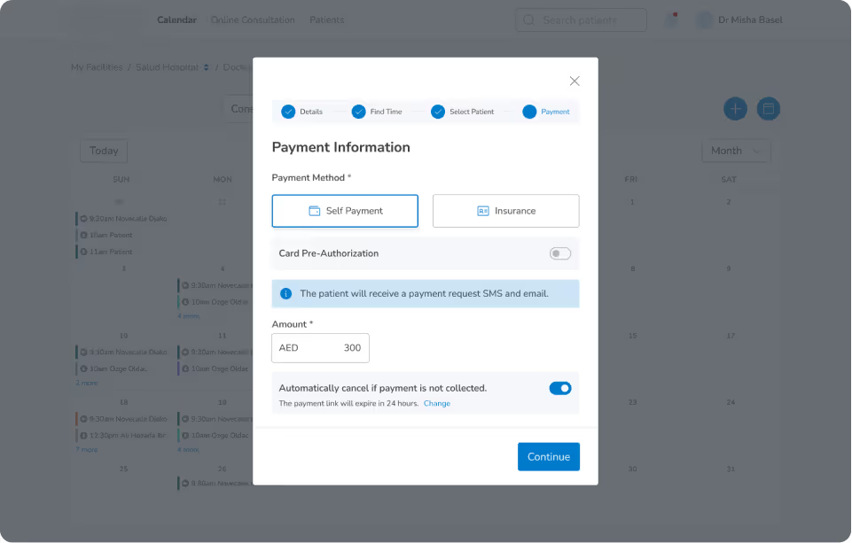
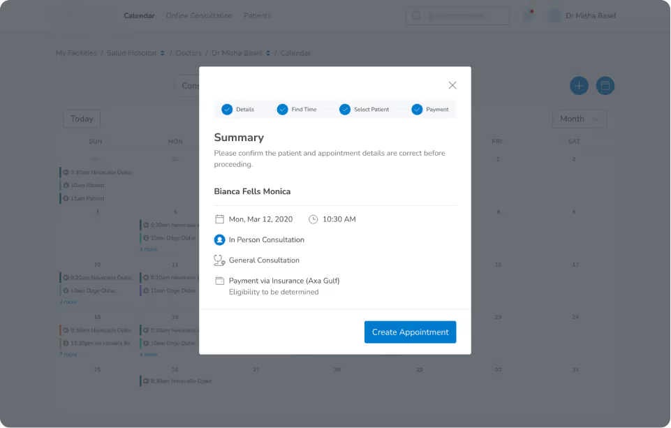
What we also discovered was that they wanted to see a Summary section, before they submit creating a new appointment. Since each part is on different tabs within the wizard, they had hard time remembering which choices they have made during the process. So we added a summary section on the last page after payment details.
Delivery UI