Onboarding Redesign for Meditopia App
.avif)
Impact
📈 Onboarding drop-off decreased from 40% to 34% (across the full onboarding flow)
Moving from a generic flow to persona-based pathways helped users immediately see how the app could support their specific goals. As a result, onboarding drop-off decreased from 40% to 34%. Users who selected a tailored pathway were noticeably more likely to complete onboarding and begin exploring content.
✨ Improved early retention & session depth
Clearer value communication and personalized recommendations contributed to a steady uplift in early engagement, including increased time spent during the first session. Qualitative feedback also showed that users felt “understood” and more motivated to continue, which helped support early-stage retention.
📣 Clearer product narrative for leadership
The refined onboarding allowed the team to articulate a sharper product value story — not just offering meditations, but supporting tangible outcomes like better sleep, emotional balance, and daily habits. This clarity strengthened roadmap planning and gave leadership a more strategic lens for positioning the product.
A/B Testing
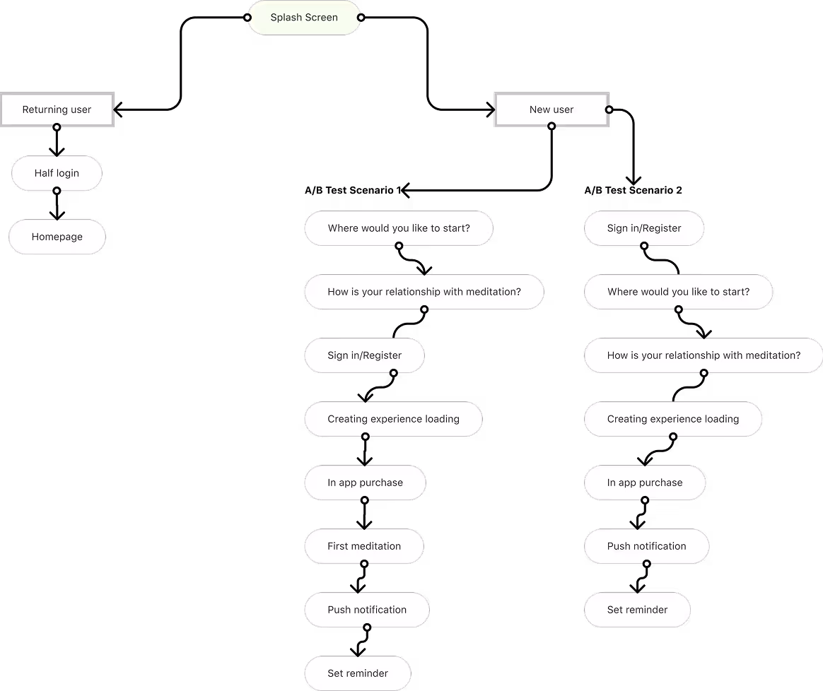
While working on wireframes for each scenario, we also ran A/Btest with our current flow to have a better understanding of howthe order of the sign-in screens would affect the user’s behavior.(Whether to show sign-in screen at the beginning or later)
We discovered that the users on scenario 1 (the ones that see the sign-in after making some personal selections) were more likely to keep staying on the onboarding flow.
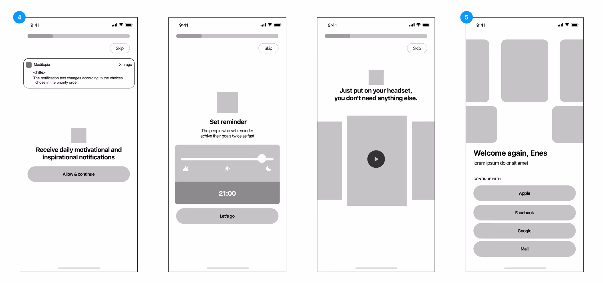
Wireframes & Low Fidelity Mockups

Highlights from Usability Tests
We got together with the users from the beginning of the process to test the flows and the initial wireframes. It was important to gain feedback on what users would expect to see, and how we were going to stand out from other meditation apps.
The users were able to complete the process successfully and they were happy seeing personalized content related with their choices.
On the last screen where we show them their first meditation, they found 5-8 min meditations too long. As completing something and wanting to actually use the app quickly - or get back to their current life they didn’t want to stay for 5 more minutes within the flow and mostly skipped. So with this information, we changed the first meditation length to 1 min to keep it short and like a welcome message.
We got together with the users from the beginning of the process to test the flows and the initial wireframes. It was important to gain feedback on what users would expect to see, and how we were going to stand out from other meditation apps.
The users were able to complete the process successfully and they were happy seeing personalized content related with their choices.
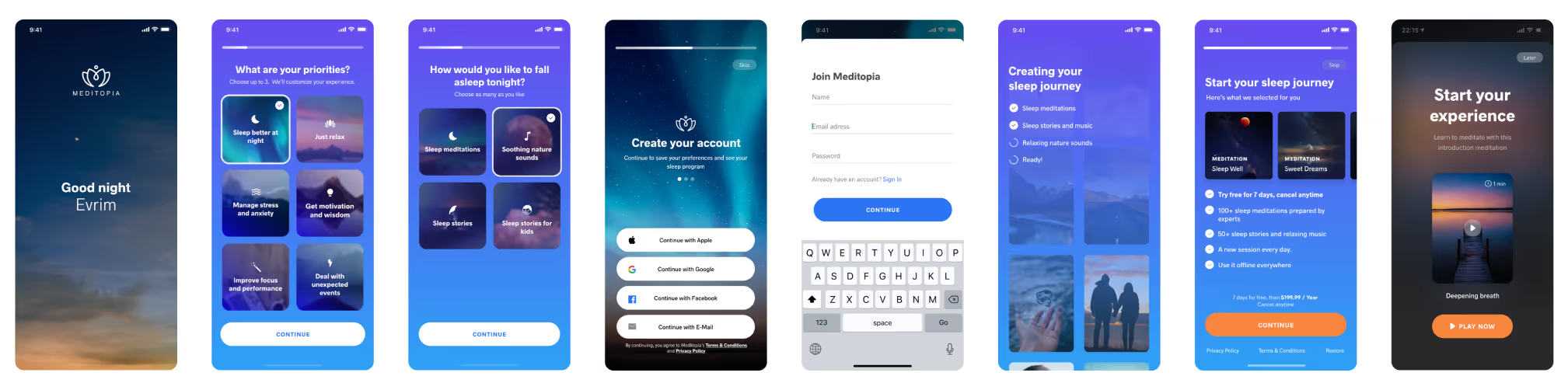
Delivery UI